Lesson
Flexbox
Intro
What is Flexbox?
Let's say we're learning HTML and CSS by building a real project: a Facebook login page. That page needs Flexbox to lay out some of its sections, so first we'll learn what Flexbox is, and then we'll use it to build the login page at the end of this lesson.
Flexbox is a CSS layout system that makes it easy to arrange items in a row or a column. Instead of manually positioning every element, you place them inside a flex container, and Flexbox helps control their direction, spacing, alignment, and sizing. It's one of the simplest and most powerful ways to build responsive layouts.
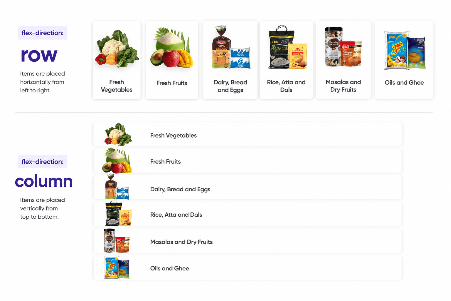
Example
Flexbox
Try it yourself in the code editor below. You can change the output screen size by clicking the 1x, 0.5x, or 0.25x buttons, and the preview updates automatically as you edit.
.stage {
  display: flex;
  flex-direction: row;
  justify-content: center;
  align-items: center;
}
Toggle the controls below and watch the boxes rearrange in real time.
Task
Build the Shopsy Shop
Solution
.product-list {
  display: flex;
  justify-content: space-evenly;
}
Project
Build a Facebook Login Page
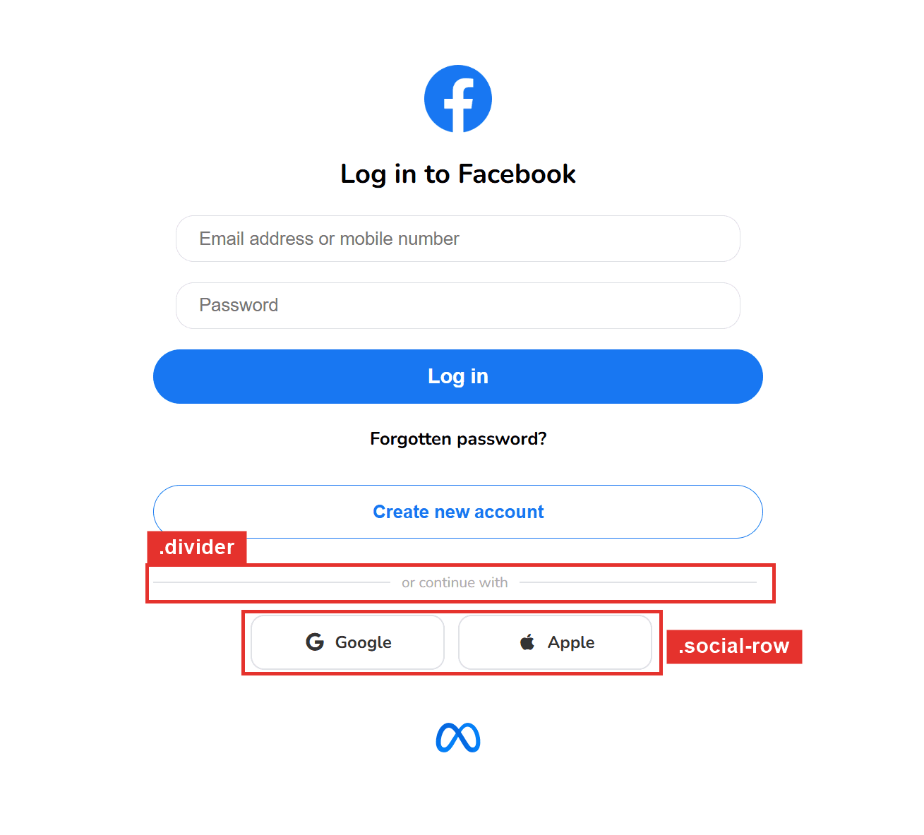
Solution
.divider {
  display: flex;
  align-items: center;
}

.social-row {
  display: flex;
  justify-content: center;
}